okey

packaging project

OKEY was created as a social mission-turned-business that would empower people to change the current food system to a more sustainable, healthy, and nutritious one. OKEY offered 100% plant-based products, which you can use to prepare your traditional recipes, incredible tasty dishes and combinations with variations of vegetables, filling the world with happiness, nature, and color. That's what we were looking for when we created the brand.
okeypackaging project

brand identity

packaging

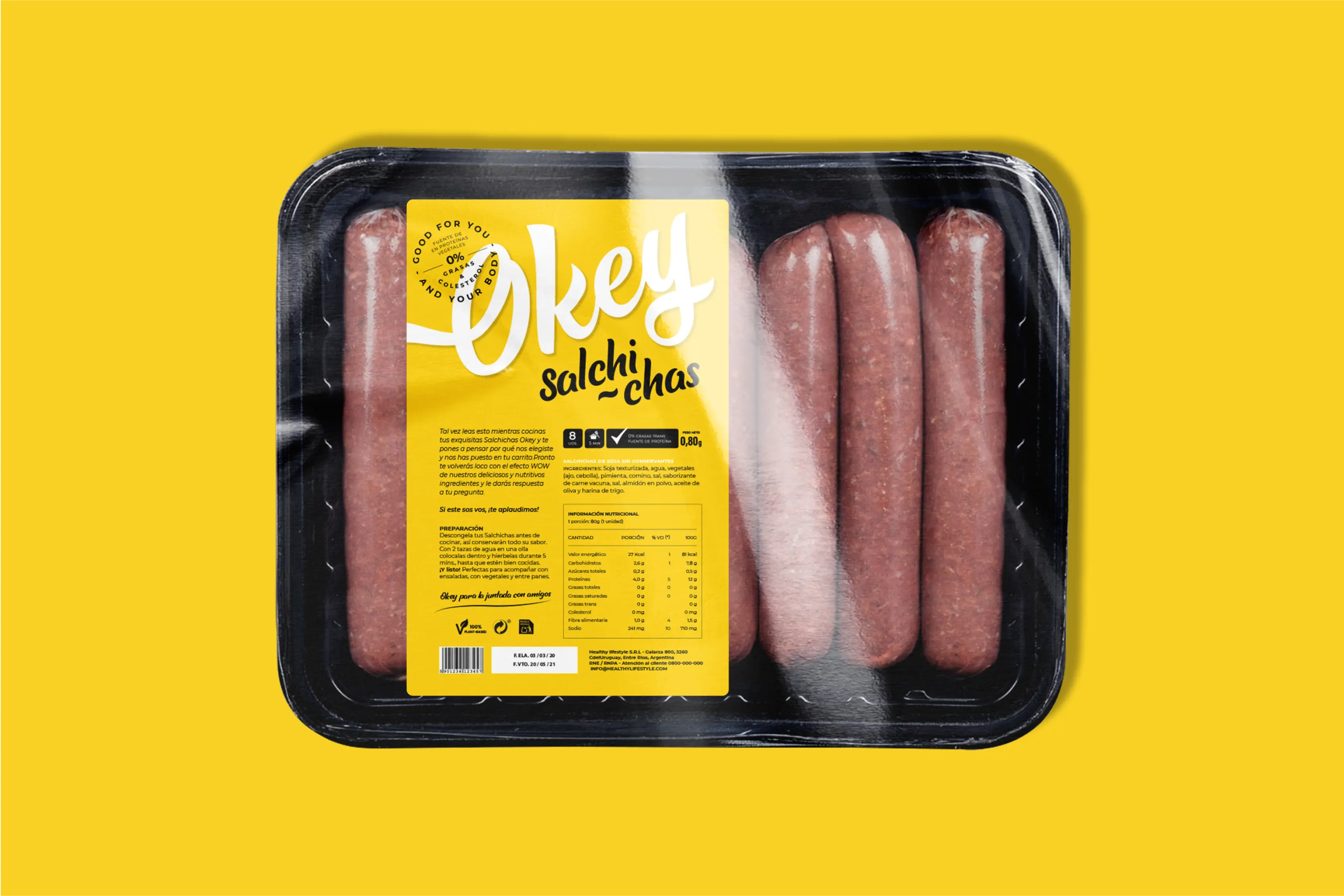
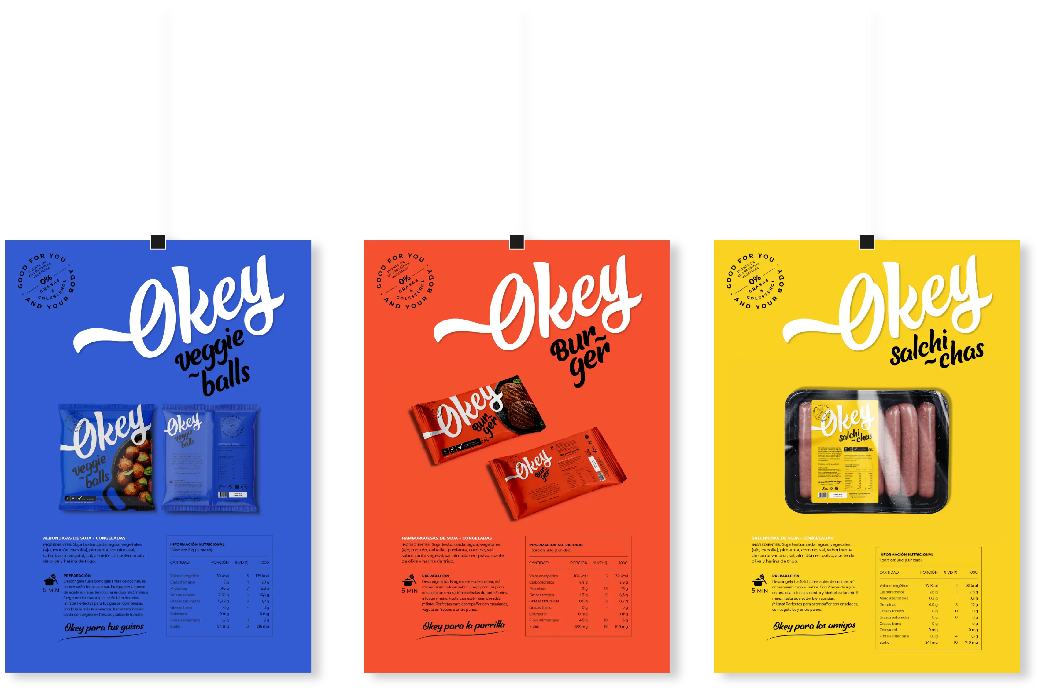
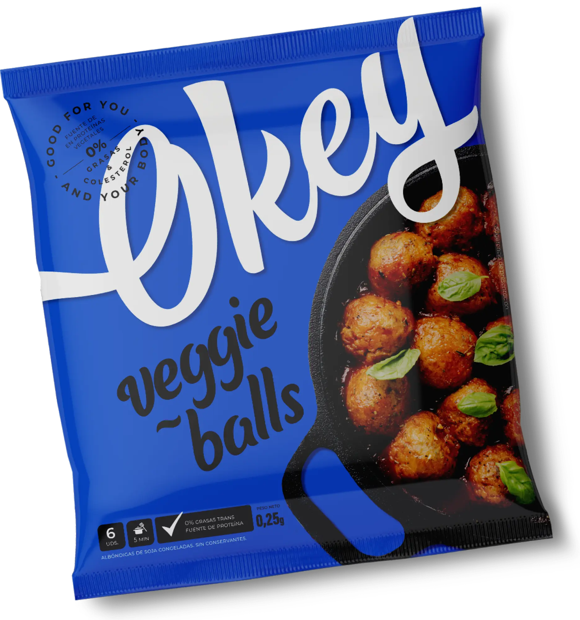
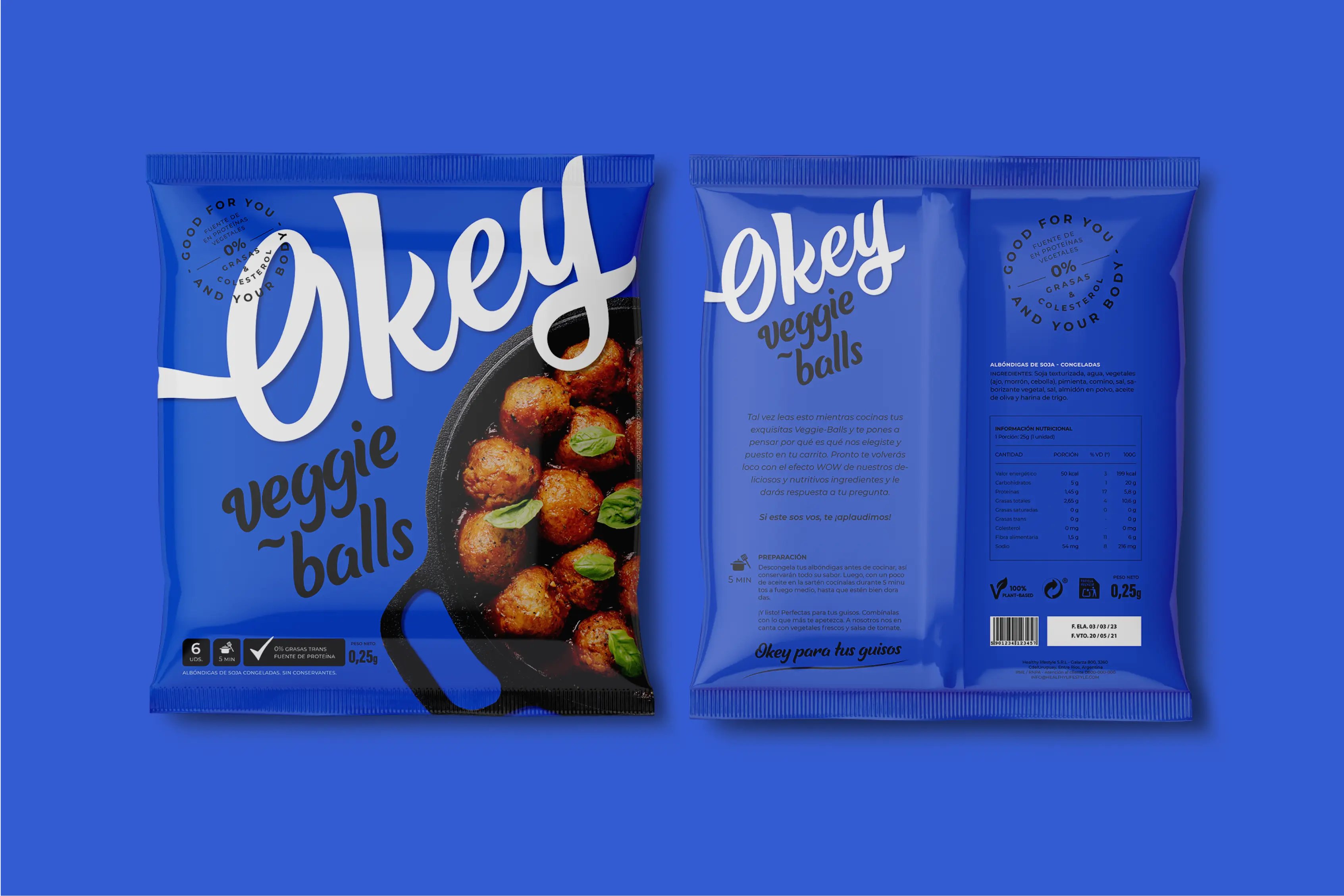
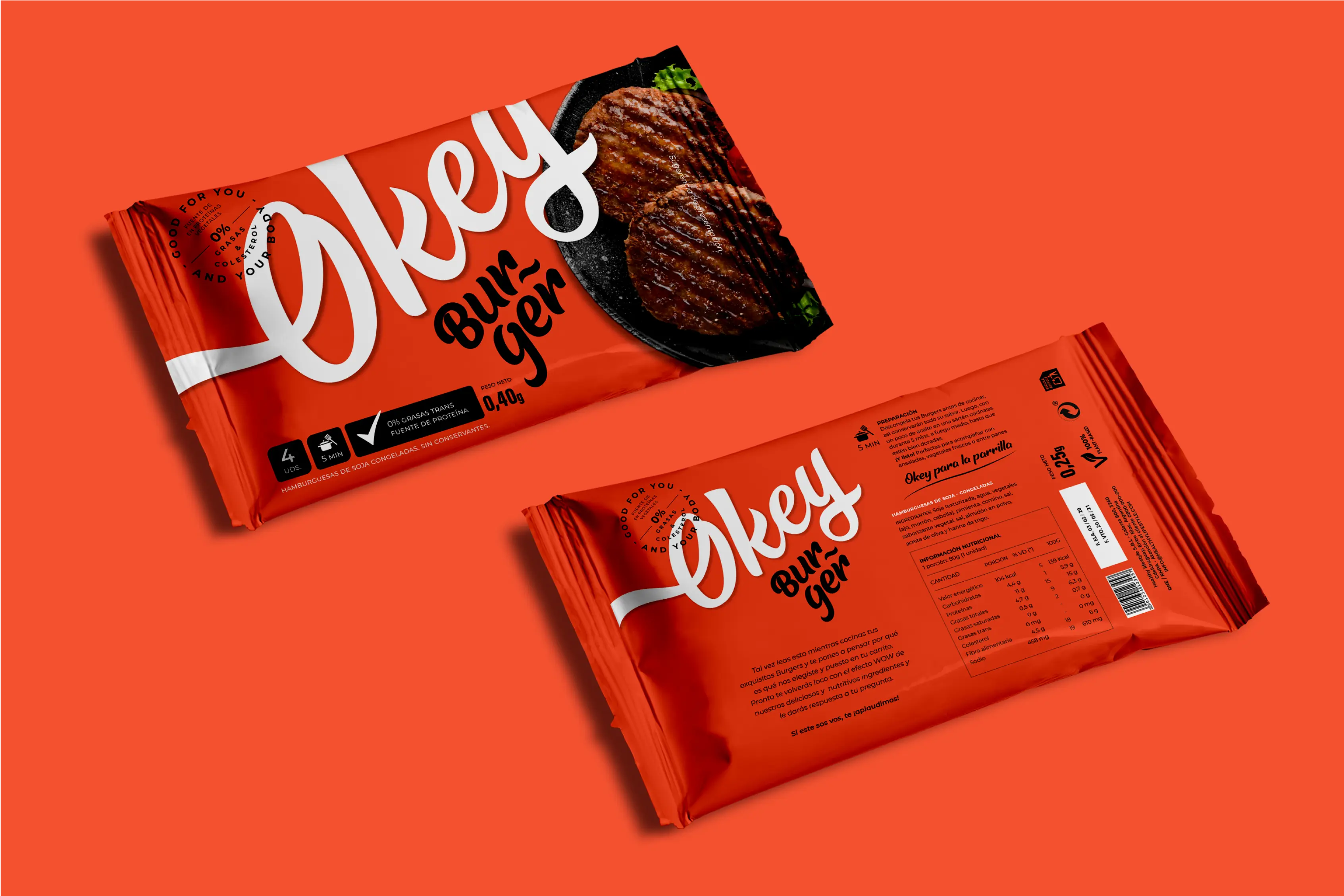
The packaging had the main intention to stand out from the competitors and express the essence of the brand; a versatile product to make your traditional meals unique, tasty, and colorful dishes, with a 100% plant-based and healthy stamp.

packaging 1-okey
packaging 2-okey
packaging 3-okey
logotype

THE MAIN CONCEPTS TO CREATE THE BRAND WERE: VERSATILITY, IMPACT, AND FUN. IT WAS NECESSARY TO BREAK THE NOTION THAT EATING HEALTHY AND PLANT-BASED WAS NOT SYNONYMOUS WITH BEING DELICIOUS, TASTY, AND COLORFUL. THEREFORE, OKEY WAS BORN WITH A TYPOGRAPHIC IMPACT, FLEXIBLE AND VERSATILE ENOUGH TO FIT PERFECTLY ON EACH PACK; AND AN EYE-CATCHING COLOR PALETTE THAT CAPTURES THE ATTENTION OF ANY CONSUMER TEMPTED TO TRY A NEW VARIETY OF REVOLUTIONARY PRODUCTS.

logo okey
#345bc7
#EF5130
#F8D600
examples packaging okey